Seranoco
Online Store for Precious Stones and Jewelry (Multilingual)
Oct 1, 2025
A multilingual store for precious stones — buy based on shape, color, and specific cuts.
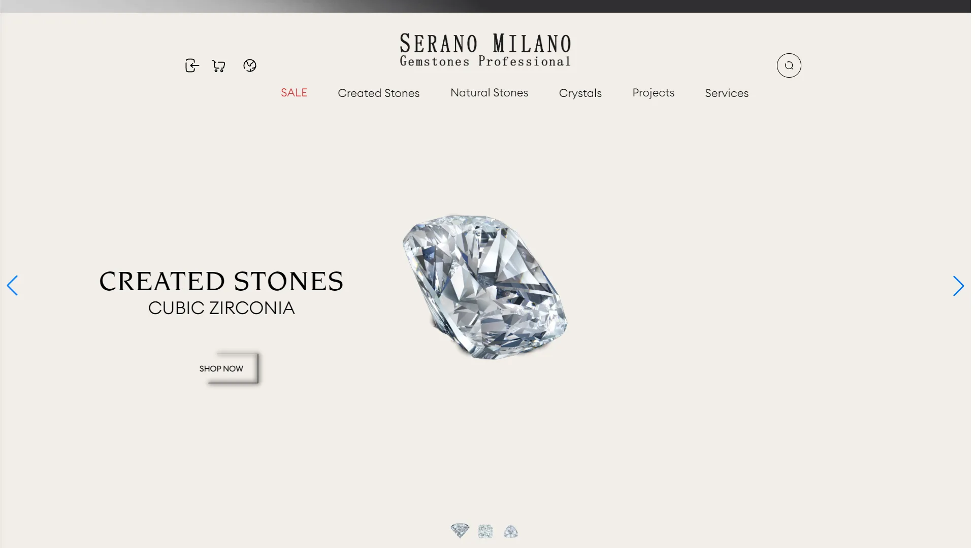
This is the primary landing page for an online luxury goods and gemstone store, designed with a minimal aesthetic, a serene atmosphere, and a sophisticated visual identity.
How can the use of negative space enhance the perceived value of luxury products?
In luxury branding, overcrowding elements can evoke a "mass-market" feel; therefore, expanding the white space around the subject allows the item to shine like a piece of art in a gallery. Here, the uniform, bright ivory background immediately directs the eye to the cut texture and clarity of the central diamond. However, the visual balance between the left-hand text block and the centered gemstone could have been more stable with tighter margins, preventing the product from appearing completely floating or aimless.
Do the call-to-action buttons and navigation elements effectively smooth the user conversion path?
Action buttons in such environments must be elegant yet inviting, with enough contrast to encourage a quick click. The SHOP NOW button, with its simple typography, complements the serif font of the heading well; however, the heavy drop shadow is somewhat inconsistent with the flat, modern nature of the other sections, giving it a dated appearance. Conversely, the slider indicators at the bottom of the page, shaped like miniature diamonds, are a creative and interactive touch, although their small size may hinder clicking precision.
Ultimately, this composition—through the clever combination of classic typography and clear product imagery—creates a calming and premium experience. With minor adjustments to shadows and button structures, it could achieve a flawless and far more professional look.
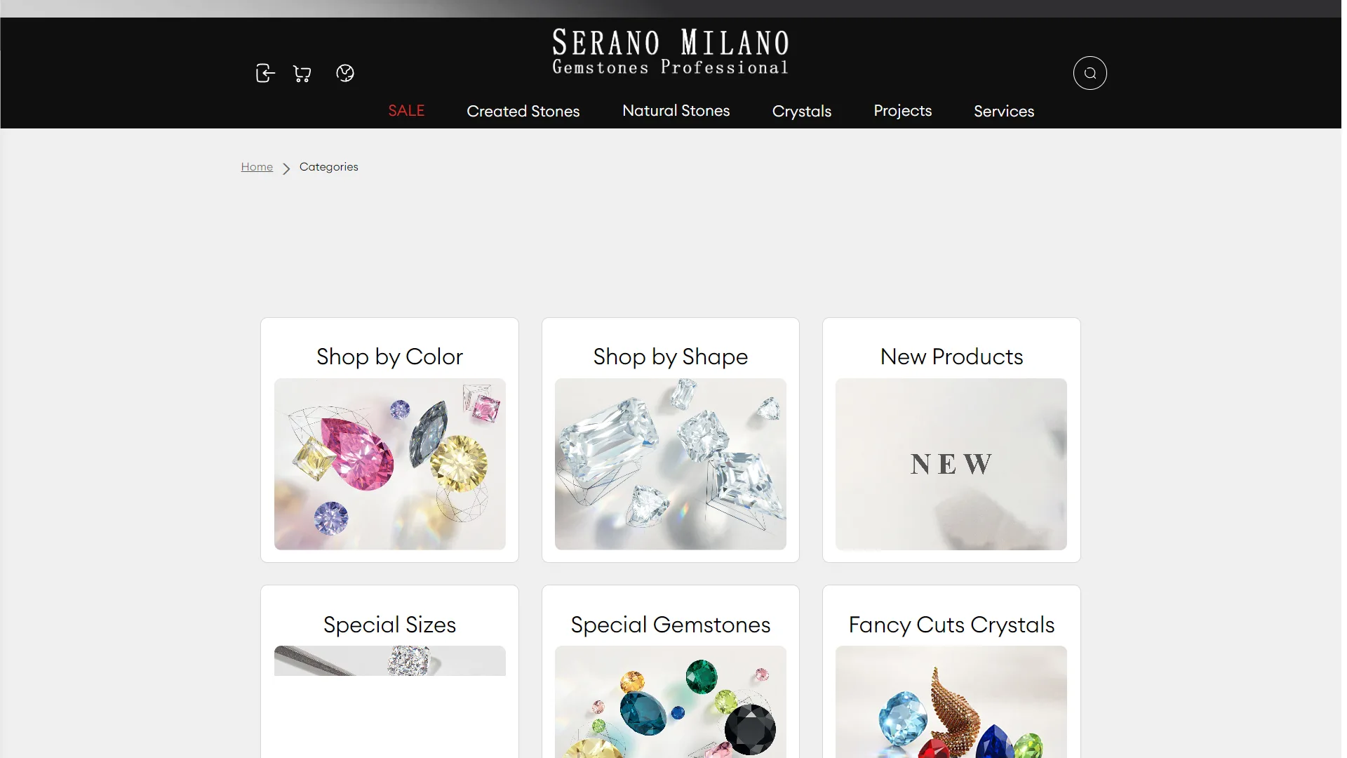
This page serves as a comprehensive category guide for a specialty store featuring precious gemstones and luxury crystals, boasting a modern and purposeful structure. The powerful contrast between the black navigation bar and the bright, serene body of the page creates a sense of dignity and clarity befitting the nature of ornamental goods.
How does the category structure help buyers select decorative stones more quickly?
In the e-commerce realm of jewelry, customers typically begin their purchasing journey based on visual characteristics and formal parameters; therefore, visual classification is of paramount importance. The layout of the primary cards, with titles such as Shop by Color and Shop by Shape, guides the selection process based on the natural needs of a designer or buyer. The fusion of geometric cut lines with colorful, brilliant stones within the cards simultaneously showcases the technical and artistic dimensions of the product. Despite the clean and open spacing between sections, adding a short guiding phrase beneath the card titles could have enriched the user's decision-making process before the final click.
How do the visual hierarchy and navigation elements convey a sense of authenticity?
Platforms offering high-end products rely on a calculated harmony between authentic typography, high-quality photography, and seamless navigation. The serif font of the SERANO MILANO logo and the photography featuring clear light reflections in the Special Gemstones and Fancy Cuts Crystals cards lend a polished and professional look to the entire structure. In the top row, the New Products card deviates from others by not using a product image, instead filled with blurred text that slightly breaks the rich rhythm of the surrounding stones; however, highlighting the word SALE in red within the menu effectively directs the viewer's eye toward the more attractive sections.
Overall, this combination of a three-column grid with soft framing and a lack of unnecessary clutter keeps the buyer's focus directly on the beauty and stunning details of each collection. The result of these structural decisions is a sophisticated and trustworthy environment that makes browsing through various cuts and stones simple and pleasant for the user.
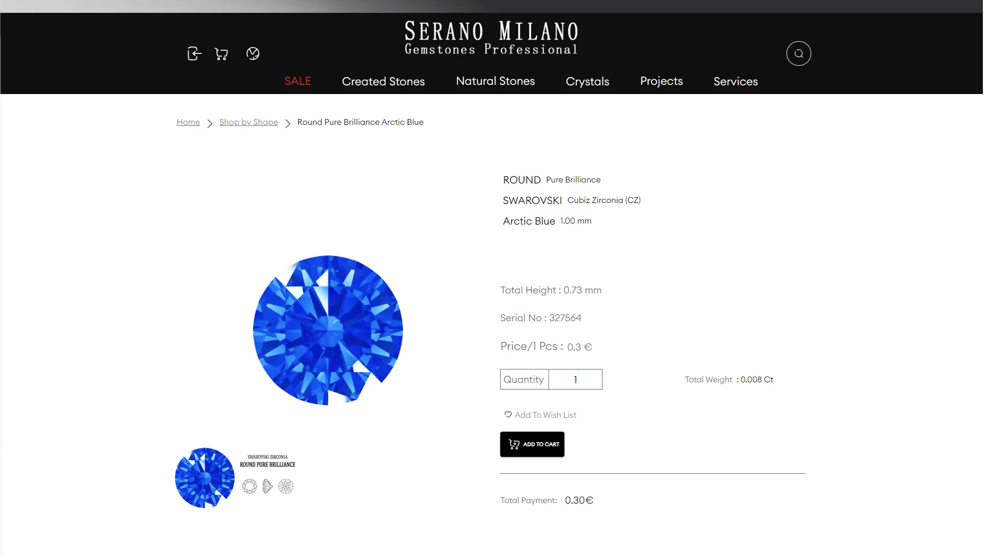
This page is a specialized product detail page for a store selling gemstones and industrial gems. Its visual style is based on a minimalist approach, utilizing extensive negative space and a striking contrast between the black header and the white body of the page.
To what extent are the technical information and dimensional specifications clear and accessible to the user?
In specialized e-commerce platforms, buyers rely more than anything else on precise material data, millimeter dimensions, and weight to make error-free decisions. In this structure, critical product specifications such as height, serial number, and exact weight in carats are arranged linearly in a dedicated right-hand column. This clean layout prevents visual clutter and makes reading granular data easy. However, increasing the visual weight of the labels and creating a softer separator between the base price and the quantity field could have enhanced the clarity of the pricing hierarchy for wholesale buyers.
How does the visual layout and user conversion path aid the final purchase decision?
On pages for luxury goods or ornamental stones, showcasing the actual appearance of the item must carry the primary burden of visual persuasion and support the operational purchase section. Here, the focused viewing angle of the blue gem in the left column, combined with the cut diagrams below, beautifully proves the piece's authenticity. The primary call-to-action button labeled ADD TO CART is designed in bold black and forms a natural endpoint for the eye immediately following the price calculations. That said, incorporating quicker controls for bulk quantities or displaying tiered volume discounts could have further optimized the conversion flow for industrial purchases.
Overall, by eliminating redundancies and focusing on the visual purity of the product, this user interface presents a transparent, calm, and trustworthy experience for evaluating jewelry specifications. The clever implementation of the two-column structure combined with the mastery of white space ensures high readability and simple navigation.
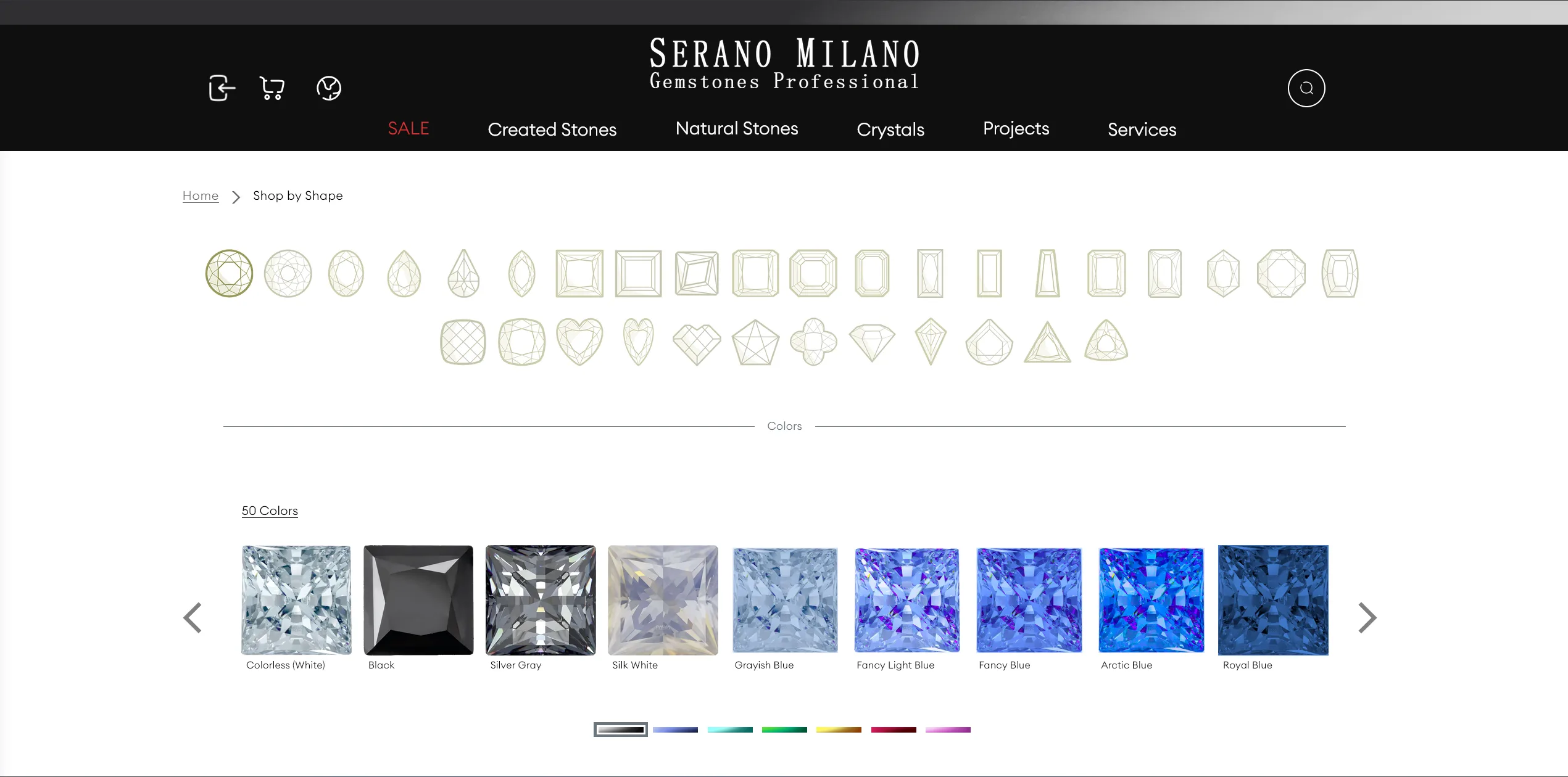
This is a specialized user interface for configuring and selecting precious and industrial gemstones based on cut, color, and dimensions. It features a minimal structure with a sharp contrast between a black header and a white body. This neutral color palette ensures the user's focus remains undisturbed on the brilliance and subtle color variations of the stones.
How can a wide variety of colors be presented intuitively and without confusion?
In products where visual characteristics are the primary driver of purchase, a clear catalog separation with realistic previews is crucial. The color selection section, labeled 50 Colors, organizes gemstones in a horizontal slider with precise lighting details and standard names such as Fancy Light Blue and Colorless, simplifying the selection process for jewelers. However, the missing image in the Grayish Blue slot disrupts the gallery's consistency and requires immediate correction and replacement of the visual asset to maintain commercial credibility.
Does the dense matrix of millimeter measurements provide a smooth user experience?
For professional buyers and manufacturers, quick, one-click access to precise measurements without navigating long dropdown menus is the greatest practical advantage. The grey grid of dimension buttons, spanning from 0.70 mm to sizes above 6.00 mm, gives the space an organized and engineered layout. Despite this efficiency, the lack of a prominent active state or range filters to group small and large sizes makes scanning this dense section somewhat demanding of extra focus.
Overall, we are presented with a functional, balanced, and purposeful page that merges the elegance of gem-cutting with technical data. Improving the interactive controls and completing the missing visual details could elevate this product selection experience to the highest commercial standards.
Serano Co is a multilingual store in the field of precious stones and jewelry where users can browse and select products based on shape, color, fancy cuts, and specific sizes. The front end of this project is implemented with React; user authentication is performed with JWT, and to implement the client's desired design, I used a combination of Modular CSS and Material UI.
Visit the site: www.seranoco.com/en