Mahsho Shop
Online store for skincare, haircare, and hygiene products
Jun 1, 2025
A world of skincare and haircare brands — from Cosrx and The Ordinary to Nivea and Dove — categorized and filterable.
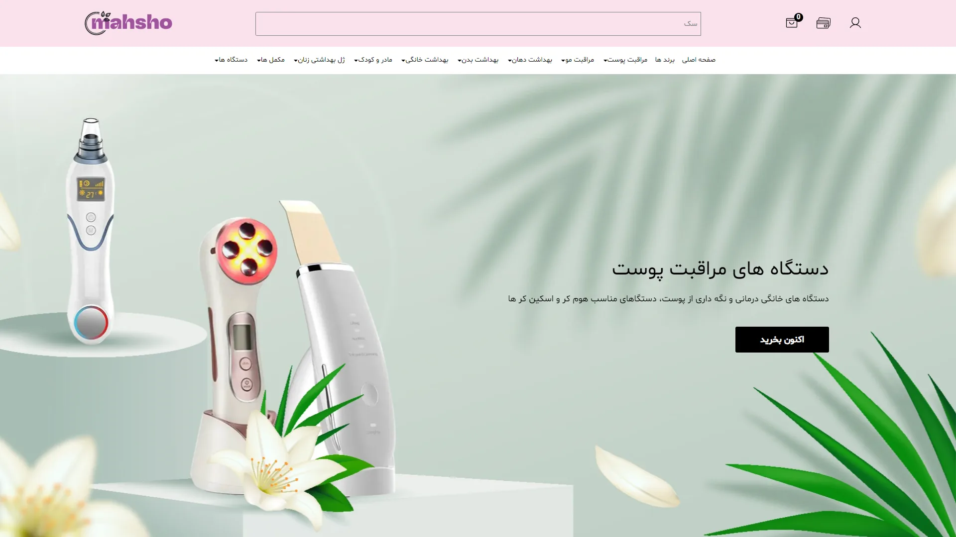
This is the main section and header of an online beauty and skincare store. Utilizing a soft pastel color palette, it conveys a sense of wellness, freshness, and quality. The clean composition combined with focused imagery presents a modern look that aligns with the standards of health and beauty websites.
How can the layout of the main banner build buyer trust at first glance?
In the design of the hero section for care products, displaying high-quality items alongside relevant visual elements—such as green leaves and natural flowers—evokes a hygienic and organic atmosphere. Here, placing three beauty devices on modern 3D pedestals directs the visual focus to the left and creates the impression of a professional-grade product, although the main title on the right could have been designed with a heavier font weight to better balance the volumetric images.
Do the Call to Action (CTA) button and menu structure optimize user conversion rates?
Interactive elements must maintain high contrast while remaining consistent with the visual language of the section to guide users toward a purchase without confusion. The black "Buy Now" button quickly grabs attention due to its sharp contrast with the mint green background, though its sharp corners slightly clash with the soft, curved tone of other elements. Conversely, the top menu, with its distinct categories and focused search bar, ensures the buyer has quick and easy access to various product groups.
How successful were the copywriting tone and typography in connecting with the target audience?
The short and clear messaging in the subheading clarifies the exact use of the equipment for both home consumers and beauty professionals. However, slightly increasing the line spacing and refining the consistency of word spacing could improve readability across different displays and provide a more polished user experience.
Overall, by leveraging soft pinks and greens, clean industrial photography, and a balanced spatial structure, this section creates a soothing and persuasive environment for introducing professional skincare equipment.
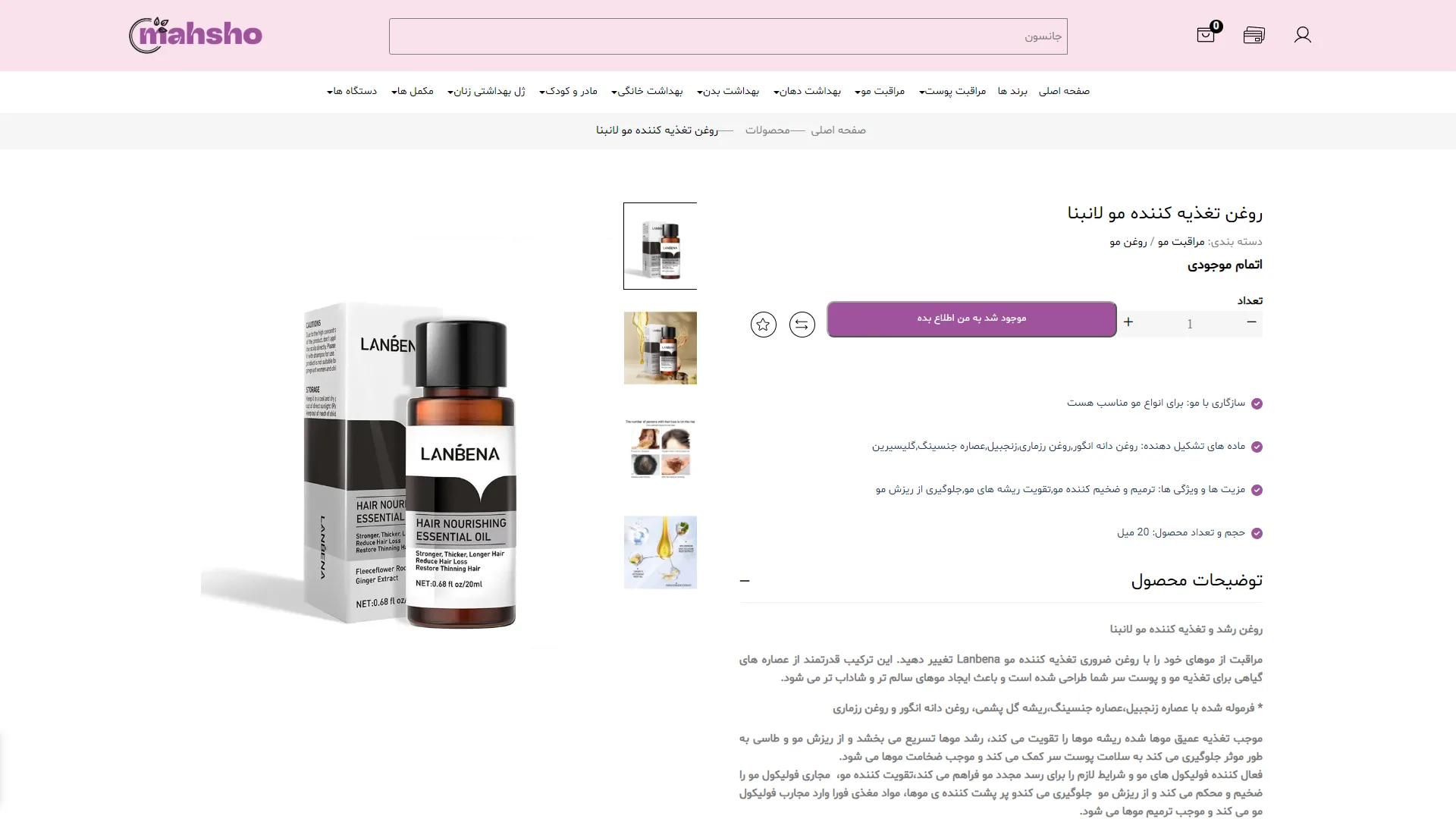
This is a product detail page for a beauty and cosmetics online store. With its soft color palette and clean structure, it creates a calming visual space perfectly suited for the beauty industry.
How is stock status and the purchasing process communicated to the user?
In product page design, transparency regarding item availability and providing alternatives when a product is out of stock prevents user drop-off. Here, the phrase Out of Stock is clearly visible, and the purple Notify me when available button serves as the primary call-to-action to maintain user engagement. The placement of the 'add to favorites' and 'compare' icons next to the button ensures easy accessibility, although visually disabling the quantity selector when an item is unavailable would have resulted in a more precise user experience.
Does the layout of information and the product gallery facilitate quick decision-making for the buyer?
An efficient layout should allow for a quick review of specifications before the user reads through long blocks of text. In this structure, the visual product gallery is on the left, and key specifications are on the right, highlighted by purple checkmark icons so the customer can grasp the volume, ingredients, and main benefits within seconds. Additionally, the Product Description section at the bottom, with its legible typography and ample spacing, fully ensures the readability of more detailed texts.
Overall, by maintaining complete harmony between the brand's visual identity and its interactive elements, this section conveys a sense of trust and simplicity to the buyer.
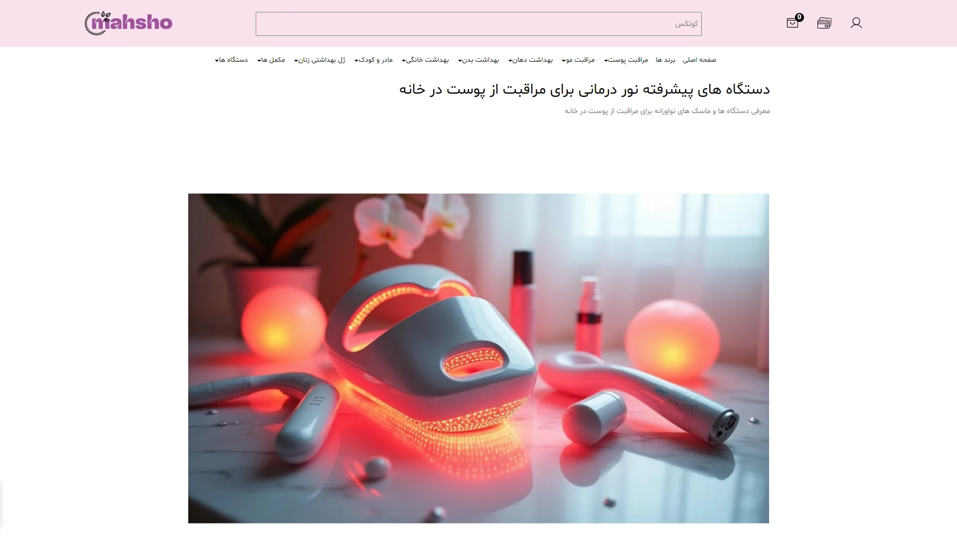
This section is a product category landing page for an online beauty and skincare store. With its soft pink color palette and clean layout, it conveys a sense of luxury and professionalism. The use of a minimalist structure in the header and menus creates ample breathing room, guiding the user's attention toward the main message without distraction.
How does the toolbar and top menu structure facilitate a smoother shopping experience?
When designing e-commerce pages with a high variety of goods, the navigation bar must ensure quick access to all sections without cluttering the interface. The dedicated search bar in the top header, distinct categories with dropdown arrows, and the shopping cart icon with a counter give the user a sense of complete control over the purchasing process. However, the color contrast of the menu text against the light pink background is somewhat low; increasing the font weight could have significantly improved the readability of the list at a glance.
How does the hero section design and the integration of text with visual elements build trust?
For home care and beauty technology products, the hero section must first and foremost evoke efficacy and quality. The staged photography, featuring the red glow of the light therapy device combined with a marble texture, suggests a modern, clinical experience. The placement of the main headline "Advanced Light Therapy Devices" and the descriptive subheadline in the upper white space keeps the typography perfectly legible; although the absence of a clear call-to-action (CTA) button, such as "View & Buy," next to these headlines is noticeable.
Overall, by intelligently combining negative space, tidy typography, and powerful visuals, this section creates a credible and eye-catching environment for showcasing professional beauty equipment.
Mahsha Shop is a comprehensive store in the health and beauty sector; offering skincare, haircare, oral and body hygiene, maternal and child products, and supplements, with dozens of Iranian and foreign brands such as Cosrx, Shiglam, The Ordinary, Nivea, Dove, and Garnier. My role in this project was technical support and development of new features using HTML, CSS, JavaScript, jQuery, Bootstrap, and PHP Laravel with Blade Template Engine.
Visit the site: www.mahshoshop.com