iTehran
Online store for Apple and mobile accessories
Feb 1, 2023
A destination for Apple enthusiasts — MagSafe cases and covers, original chargers and cables, power banks, and Apple Watch bands, all with a warranty.
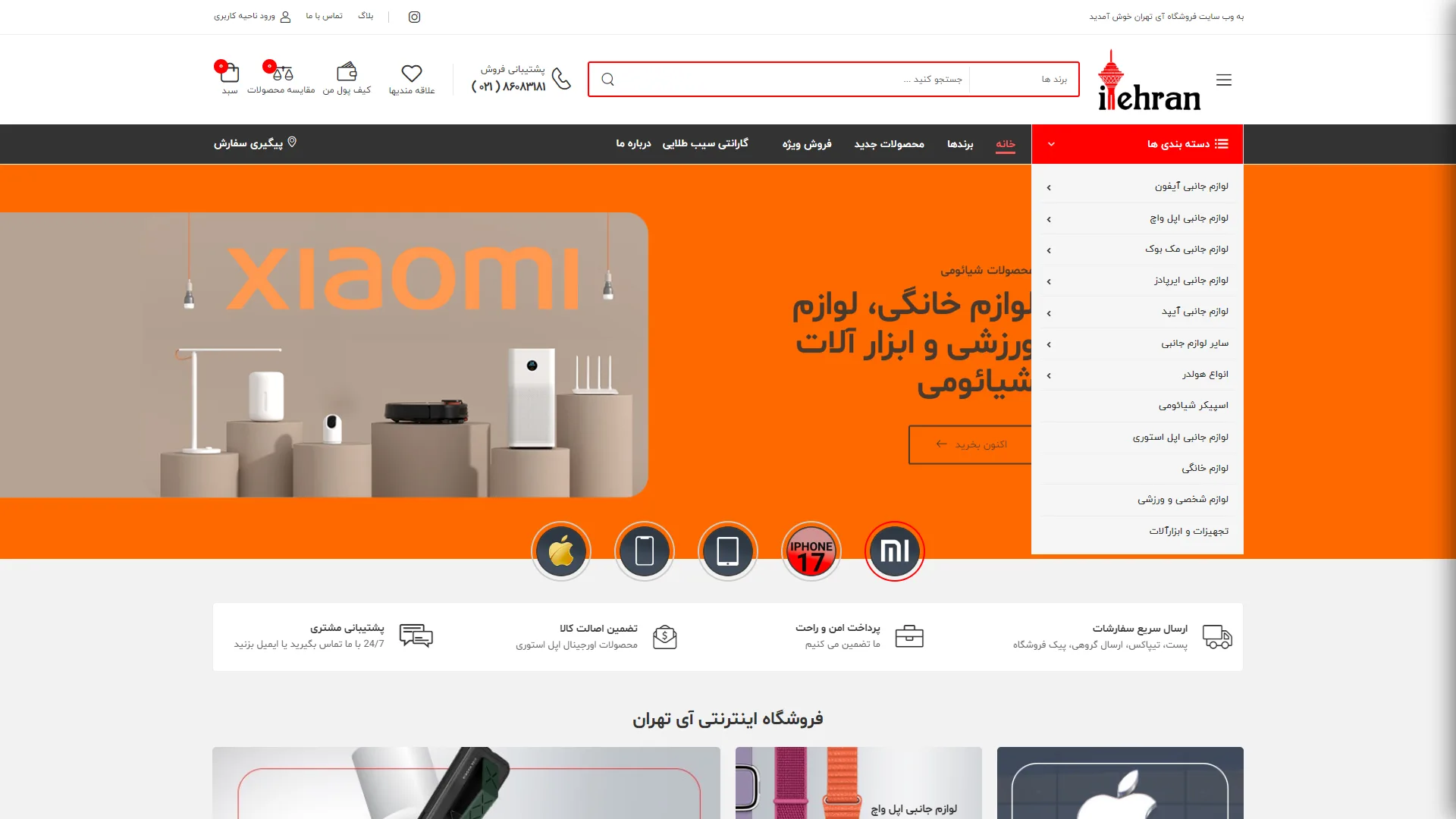
This page is an online store featuring an orange and white color palette and a fully commercial visual structure, focusing primarily on showcasing Xiaomi products and their various categories.
How can navigation across different categories be simplified on this page?
The design of a category menu in an e-commerce website should allow users to access all subcategories without confusion; here, the right-side dropdown menu with a white background and black text opens smoothly, displaying categories such as iPhone accessories and Apple Watch in an organized list, although the text density in this menu could perhaps benefit from better spacing to allow it to breathe.
Does the main banner section successfully capture the user's attention for special products?
A successful homepage banner should convey the commercial message to the audience within the first few seconds using high-quality images and bold headlines. In this view, the warm orange background combined with studio imagery of Xiaomi products and a call-to-action (CTA) button reading "Buy Now" creates a powerful visual contrast that effectively draws the eye.
Ultimately, the layout of key elements—such as the search bar at the top, shopping cart icons, the category menu, and the service bars below the banner—creates a cohesive and user-friendly structure for a seamless online shopping experience.
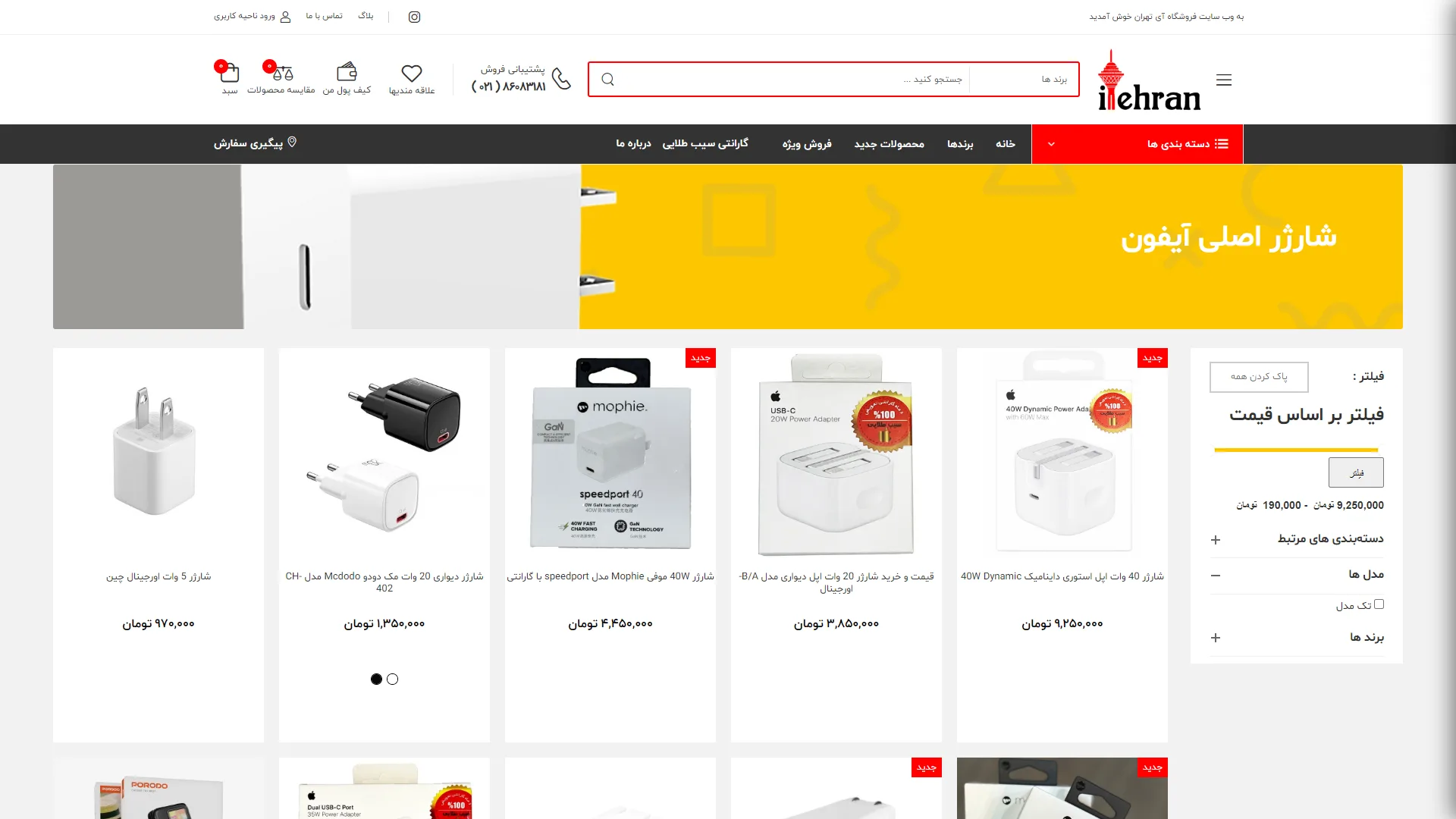
This page is an online store for digital products. With its dense visual design style, multi-layered menus, and yellow hero section, it focuses primarily on the mobile accessories category.
Is the site's navigation structure and header clean and intuitive enough?
In a successful online store, a user should be able to access the shopping cart, the central search bar, and the main categories in a fraction of a second. The header seen here is somewhat confusing and detracts from the visual focus due to the overabundance of icons, contact numbers, and the red menu below.
How could we improve the efficiency of the filter panel and product cards?
Using a right-hand sidebar for price and category filters is a standard choice for right-to-left languages. However, the product cards, with their white margins and uniform background, lack clear boundaries, and the red "New" labels create a visual clash against the packaging.
Overall, despite the high information density, this layout requires a review of spacing and the removal of redundant elements in the header to create a smoother, more modern customer experience.
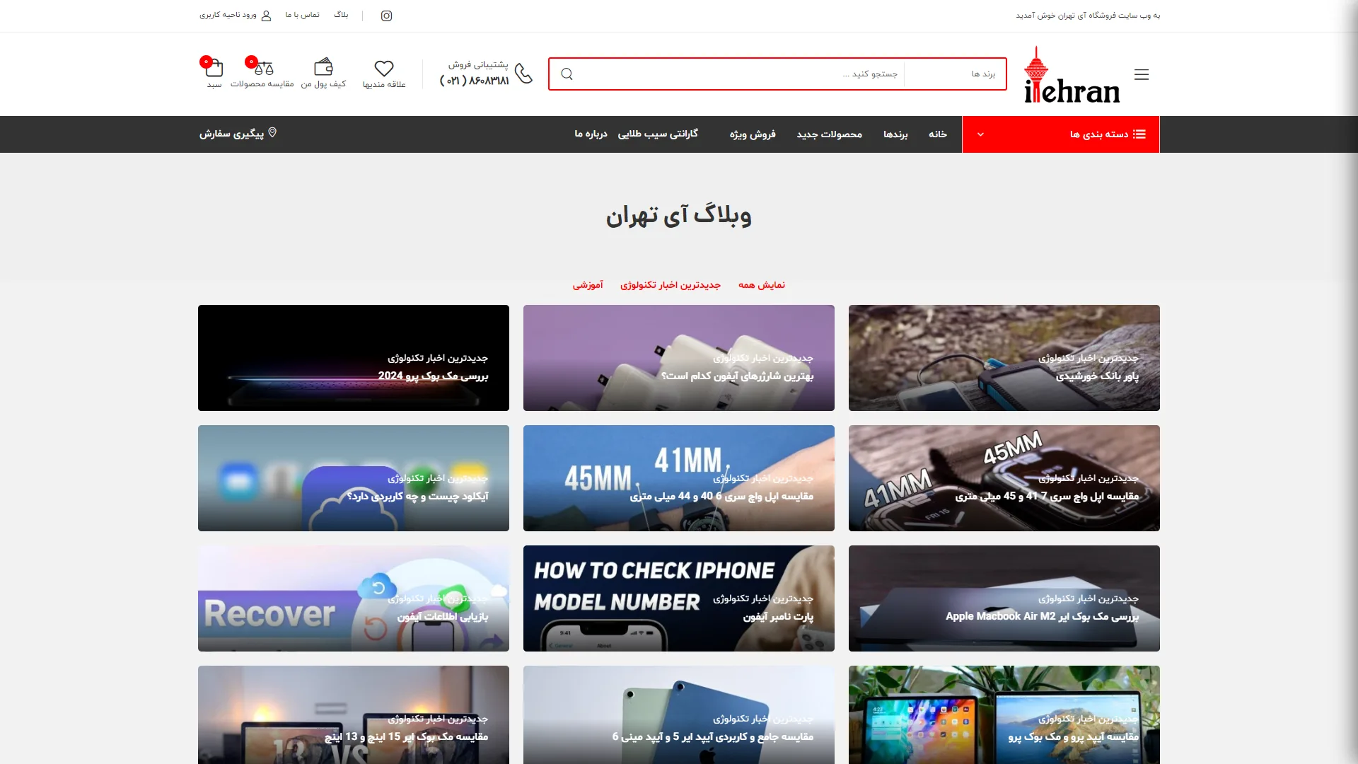
This page is a blog or a store's articles section featuring a minimal grid structure. With a clean color palette and ample white space, it creates a strong focus on educational and news-related content.
How does this grid layout help readers find their desired articles faster?
In standard online magazine design, article cards should be arranged with proper spacing and clear featured images to prevent visual fatigue. In this section, the use of rectangular cards with rounded corners and legible titles overlaid on images creates a pleasing visual order that makes finding topics effortless.
Is the hierarchy of headings and categories sufficiently clear and functional?
The separation of topics at the top of the article list, highlighted in a distinct red, provides an excellent visual guide for navigating between different categories. However, the wide variety of images and uniform card sizes might emphasize the need for more advanced filters or more granular thematic categorizations.
Overall, this layout strikes a proper balance between aesthetics and content efficiency, creating a professional space for reading tech news and articles.
iTehran is a specialized store for accessories for Apple products and mobile devices; featuring MagSafe cases and covers for iPhones, original chargers and cables, power banks, Apple Watch bands, and screen protectors from brands like Prudo, Mophie, GC-Pal, and Vivo, all with a valid warranty. The store's user interface is implemented with HTML, CSS, and JavaScript, and its back-end runs on PHP Laravel with Blade Template Engine.
Visit the site: itehran.shop