Arka Design
Sales and introduction of modern and functional equipment for beauty salons and specialized centers
Oct 1, 2026
Design and development of an online store to showcase and sell salon equipment, ranging from beauty chairs and beds to trolleys, pedicure equipment, and salon decor.
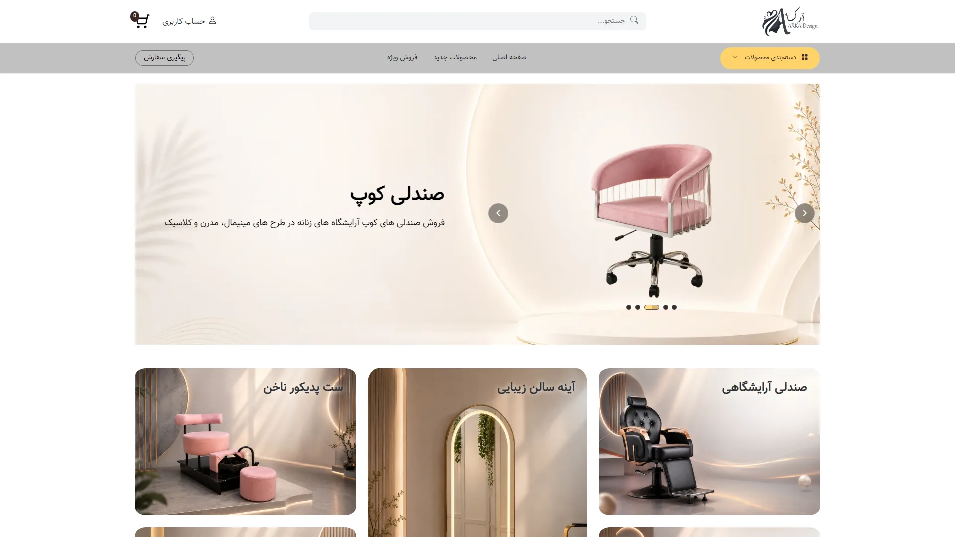
This is the homepage of an e-commerce and home decor website. Utilizing a minimal, bright, and modern design style, it conveys a sense of luxury and serenity to the visitor. The visual structure is clean and well-organized, guiding the user toward the main sections without any confusion.
How can you capture the user's attention with key products at first glance?
A large slider banner at the top of the page is the best tool for showcasing flagship products, ensuring users encounter special offers immediately upon entry. On this page, the high-quality, attractive image of a pink chair on an illuminated platform, paired with a legible title, short description, and navigation arrows, achieves this goal effectively.
Are the navigation structure and categories sufficiently accessible and legible?
The top menu should include essential options such as search, user account, shopping cart, and product categories to ensure users reach their destination as quickly as possible. Here, the central search bar with a clear icon, the yellow categories button on the right, and the cart icons on the left create a good visual balance, although the top white space could perhaps be slightly more compact.
How does the layout of the product cards at the bottom of the page affect the shopping experience?
Presenting products in image-centric cards with rounded corners and bold titles allows the visitor to easily browse the store's various categories. These three horizontal cards below the main banner, with their warm and minimal imagery, reinforce a sense of quality; however, adding direct call-to-action buttons on them could have accelerated user engagement.
Overall, this soft cream and white color palette, combined with legible Persian typography, creates a pleasant and professional environment for shopping for salon and decor products, where everything is perfectly in its place.
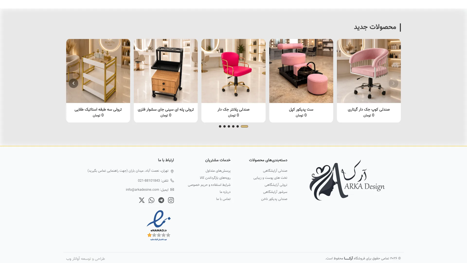
This section of an e-commerce website displays the new products slider along with the footer. Using a neutral color palette and subtle visual elements, it creates a calm environment for browsing goods.
Is the layout of the products and cards legible and engaging enough?
In a standard e-commerce design, product cards should feature appropriate spacing and high-quality images to encourage users to explore further at first glance. In this view, the cream-colored cards with rounded corners and clear images of salon equipment create a good sense of order, although the prices are currently left at zero tomans; replacing these with actual figures seems essential to complete the shopping experience.
How effective is the footer design and information categorization in guiding the user?
The bottom section of a page should provide quick access to important links, contact methods, and trust badges without becoming overly cluttered. The columnar layout of categories, alongside social media icons and the e-namad logo, achieves an acceptable visual balance on this page, but the font size appears slightly too small, which may pose readability challenges on smaller screens.
Overall, with its soft color combination and tidy structure, this view provides a solid foundation for an equipment online store that could look much more professional by fixing minor text and pricing deficiencies.
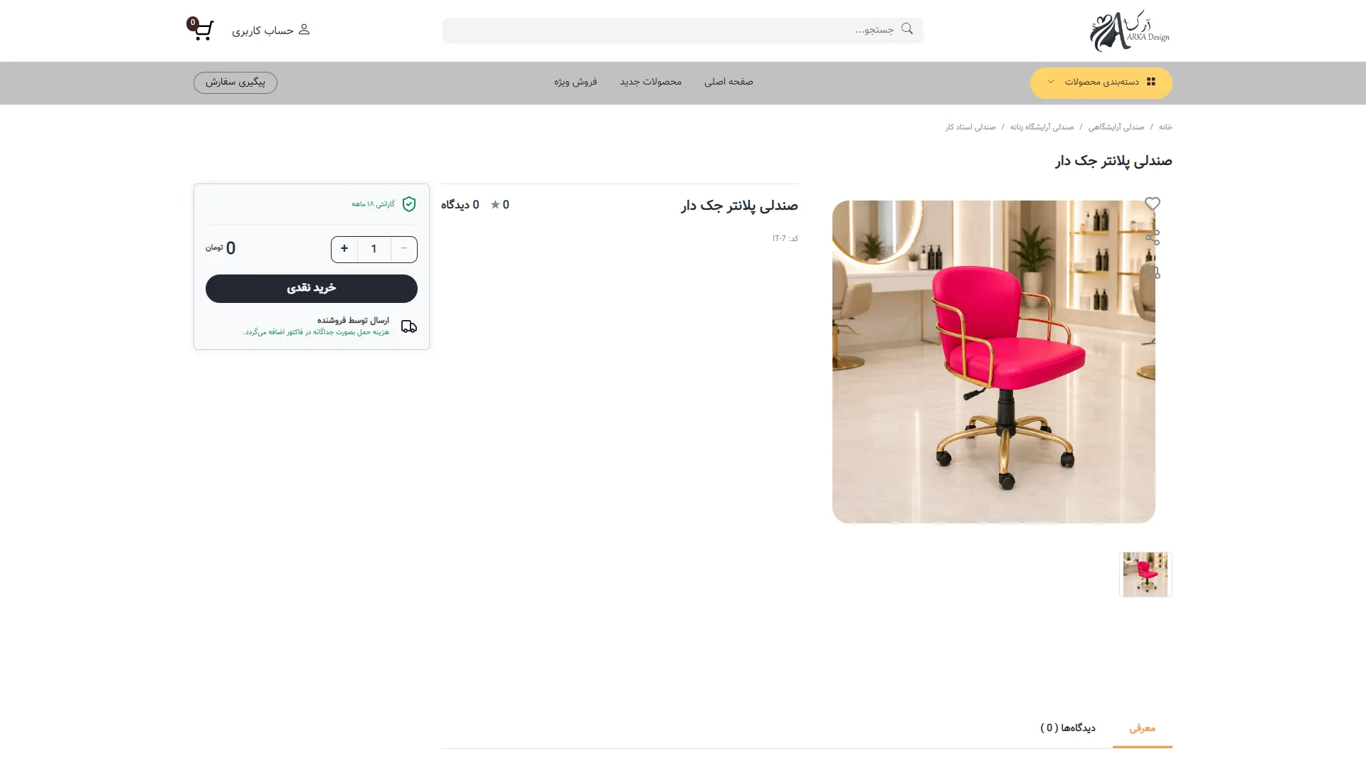
This is a product page for an online furniture and salon equipment store. With a clean layout, it focuses on delivering key information and appealing product imagery.
Does the page structure help the buyer navigate the decision-making and purchasing path more quickly?
In a standard e-commerce design, pricing information and the purchase button should be in the most visible spot to prevent user confusion. On this page, the purchase box is set apart on the left with a dark background, and the quantity selectors along with the prominent "Cash Purchase" button provide quick access, although the missing price may overshadow this strength.
How can the visual quality and authenticity of the featured product be conveyed to the user at first glance?
High-quality images and an environment that showcases the physical characteristics of the product play a vital role in attracting customers. The industrial photography of the pink chair with gold legs in a modern salon conveys a sense of luxury and creates strong visual harmony.
Is the navigation guide and access to the site's secondary sections designed clearly enough?
The top menu and breadcrumbs help users keep track of their location within the category structure. At the top of the page, the precise path from the home page to the master stylist chair, combined with a prominent search bar and a yellow category menu in the header, adds a nice level of dynamism to the navigation.
Overall, this clean and minimalist layout provides an excellent foundation for focusing on the product; it simply requires the addition of pricing information and further details.
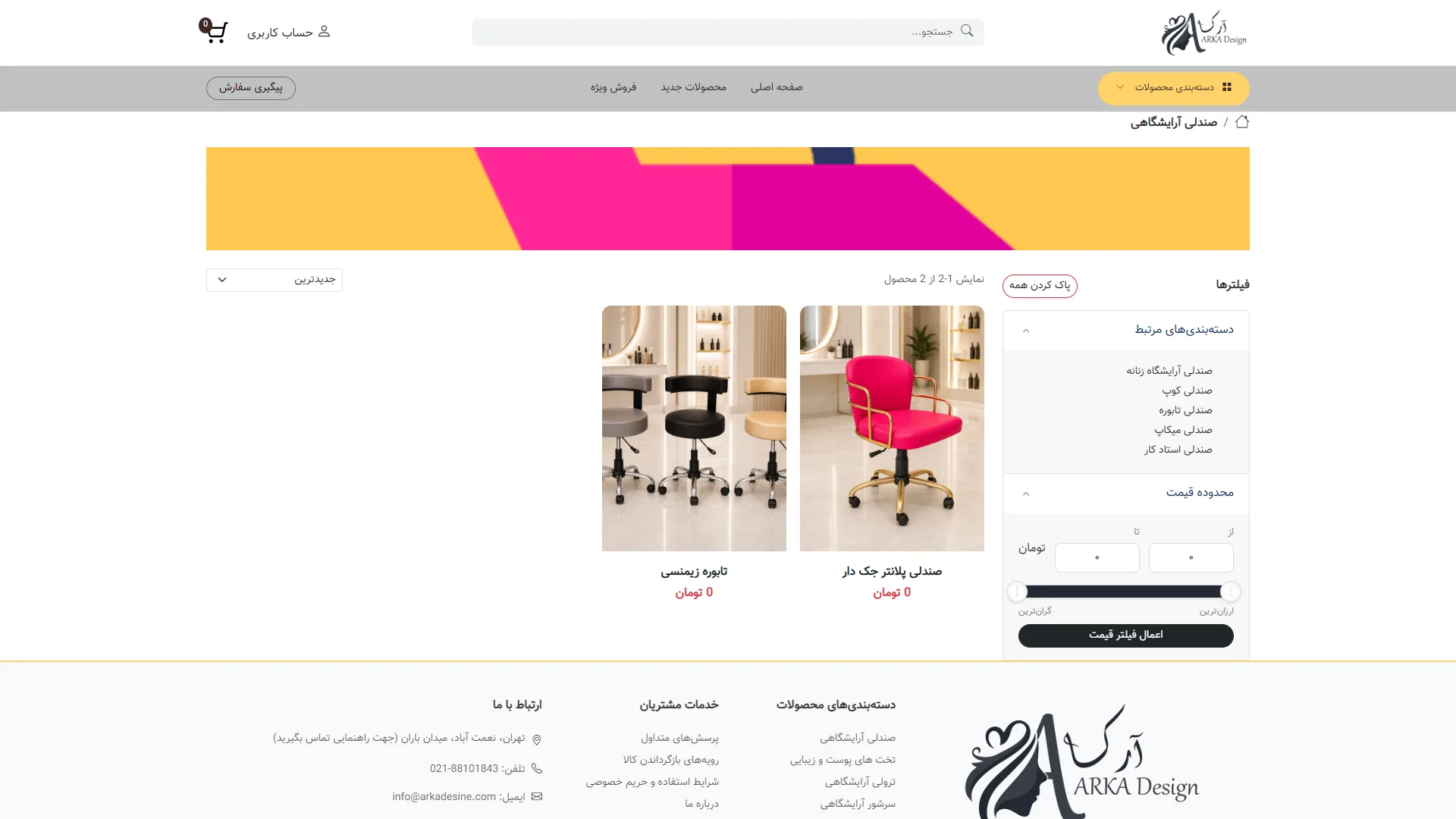
This is the product archive and shop page, designed with a minimal structure, orderly column layouts, and a neutral color palette to ensure the visitor's focus remains entirely on the items on offer.
Does the structure of the filters and categories help the user find their desired product more quickly?
In an efficient online store, the filter panel should be accessible and uncluttered to prevent the user from getting lost; in this view, the filter column on the right is well-implemented, featuring distinct options for relevant categories and price ranges. However, the use of dark colors for the 'Apply Filter' button is slightly too distracting and could have appeared in a softer tone to better harmonize with the overall feel of the page.
Do the product cards and imagery convey a sense of quality and trust to the customer?
The photographic quality and framing of product cards play a vital role in a store's conversion rate, which is well-executed here with high-quality images and white backgrounds for the salon chairs. The inclusion of legible titles and prices at the bottom of the cards also enhances clarity, although the zeroed-out prices—used as test samples—are a bit of a letdown.
Does the header and top navigation provide a smooth user experience for moving between sections?
Standard navigation should provide the fastest possible access to the shopping cart, user account, and search engine; the top bar of this page achieves this goal with the precise placement of the cart icon and the category dropdown menu. The wide graphic banner at the top also makes the visual space more attractive, though it might have been better with a lower height so that the main content and products would come into the user's view sooner.
Overall, this layout strikes a proper balance between modern aesthetics and commercial functionality, providing an organized and trustworthy space for online shopping.
Arka Design is a specialized store for beauty salon equipment and decor, offering a diverse range of modern and functional products. With a focus on precise product categorization, feature highlights, and a seamless shopping experience, this website provides a platform for beauty professionals and salon owners to quickly access the equipment they need.